

A brandbuilt to scale.
A look inside the strategy, design decisions, and visual systems behind Truesight.





Introduction
An identity should do more than create recognition. It should give an organization a shared language, a clear sense of direction, and the tools to communicate consistently.
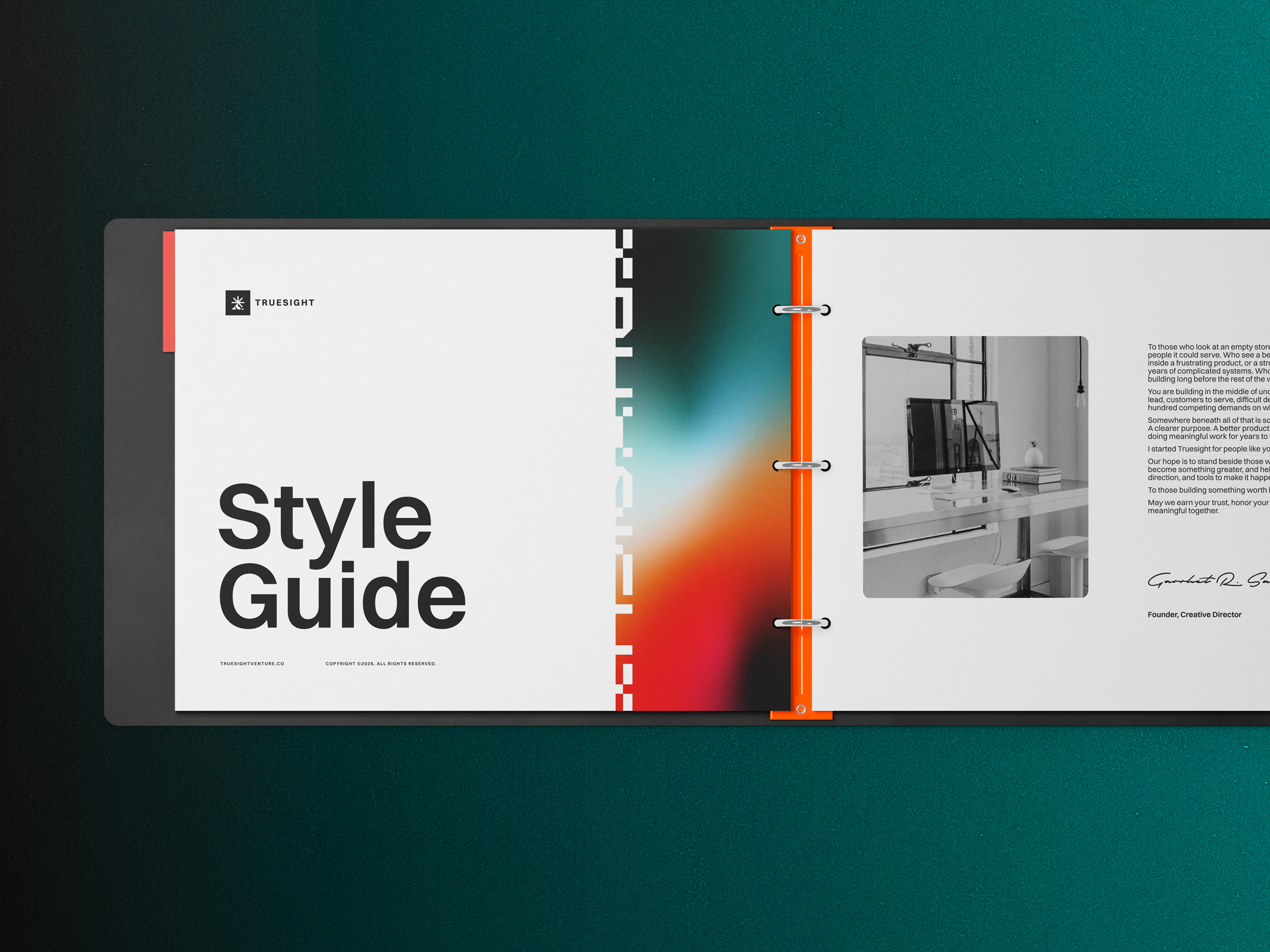

The System Behind Truesight
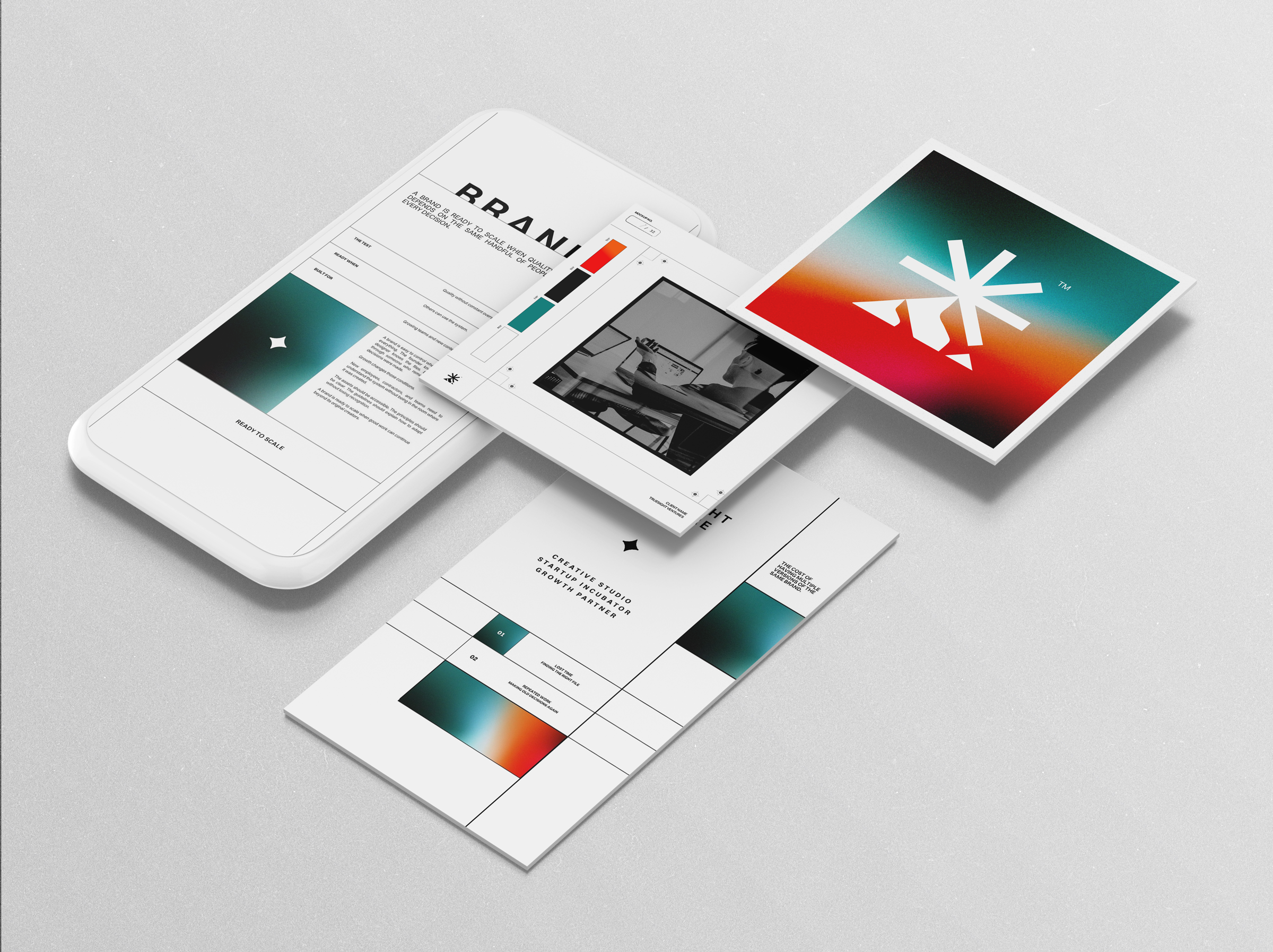
We believe great brands begin with understanding what makes an organization worth recognizing. Its purpose, people, perspective, and the opportunities it exists to pursue. That philosophy shaped the Truesight identity, from our distinctive mark to the visual language that carries our ideas into the world.
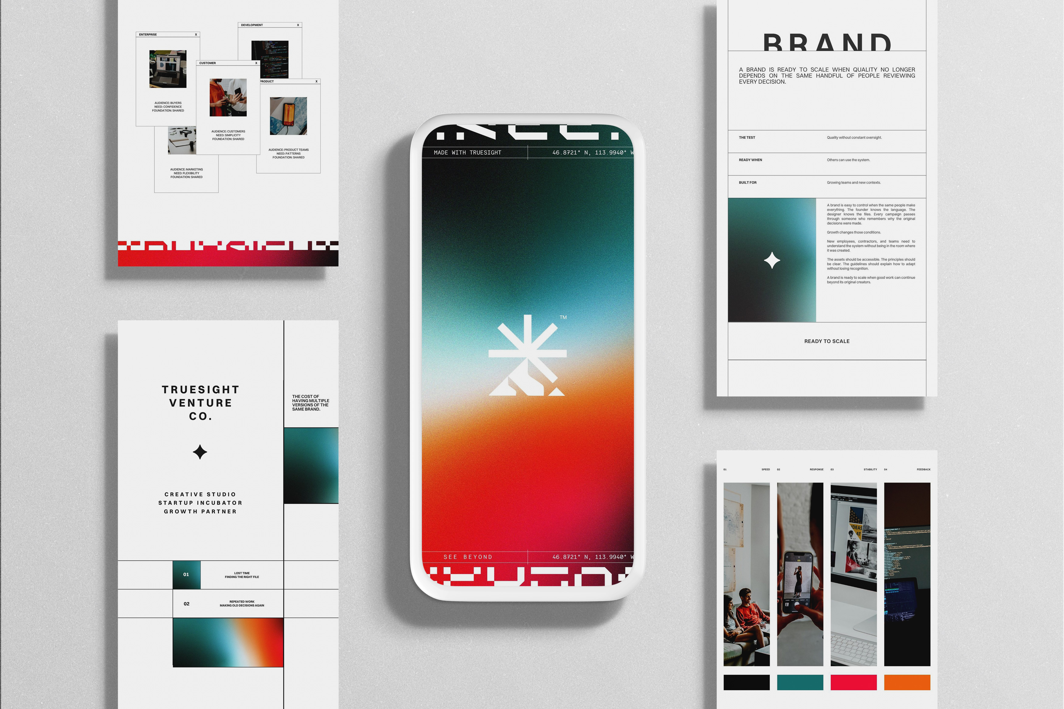
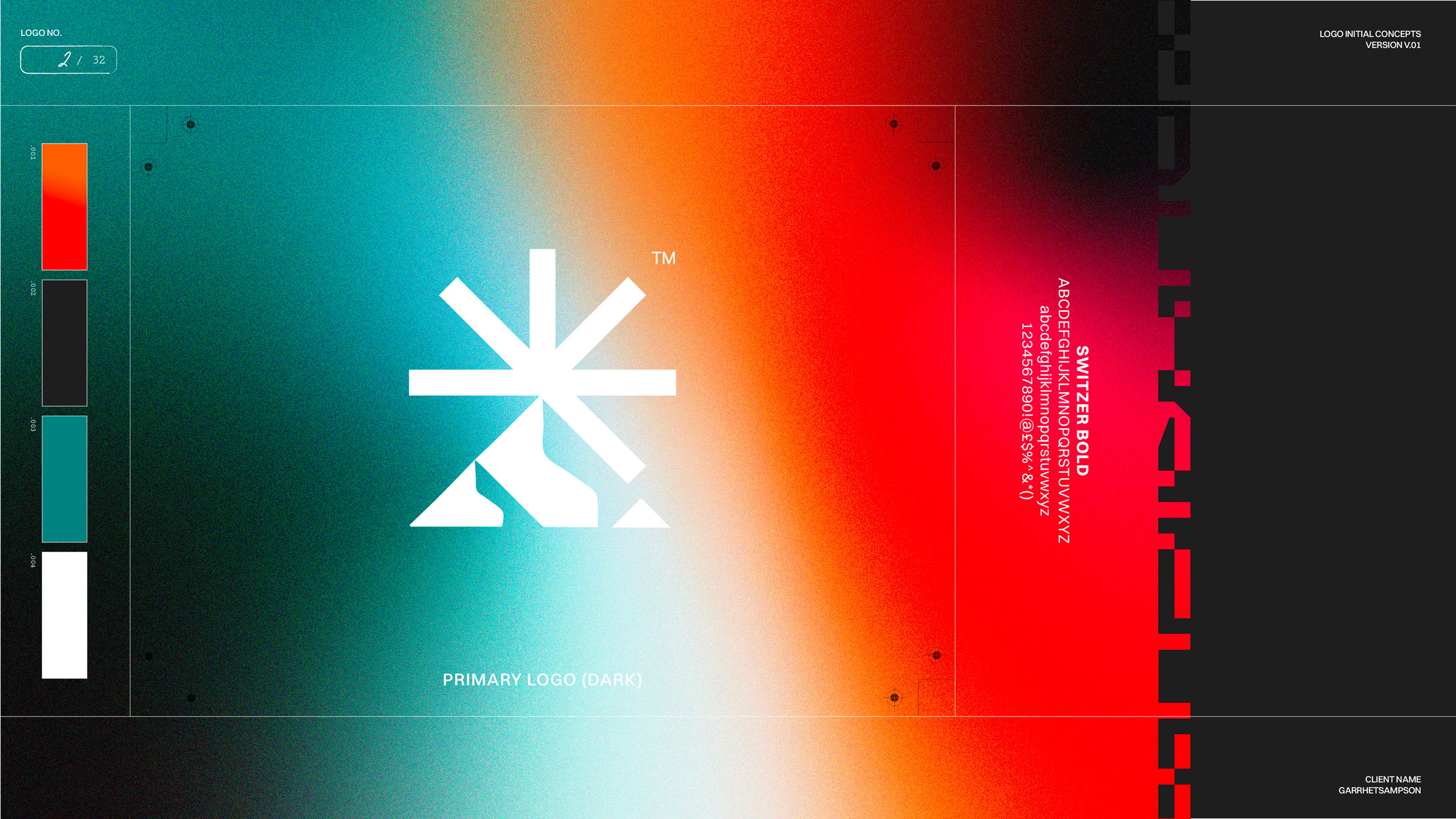
Our identity combines thoughtful geometry, expressive typography, considered color, and a flexible design system. Each element has a specific role. Our mountain and radiating asterisk represent perspective and possibility. Our typography balances clarity with creative expression. Our visual language connects these elements into a recognizable experience across digital products, printed materials, and physical environments.
This page offers a closer look at those decisions and the standards that guide their application. It also demonstrates the kind of work we believe strong brand systems should accomplish: turning a clear point of view into something that others can understand, use, and build upon.
These principles allow our identity to evolve without losing the ideas that make it distinctive.
A great identity is the beginning. The real test is how well it works.
Logo
Our icon combines a mountain and radiating asterisk, representing our Montana roots, the clarity of vision, and the potential waiting to be discovered.
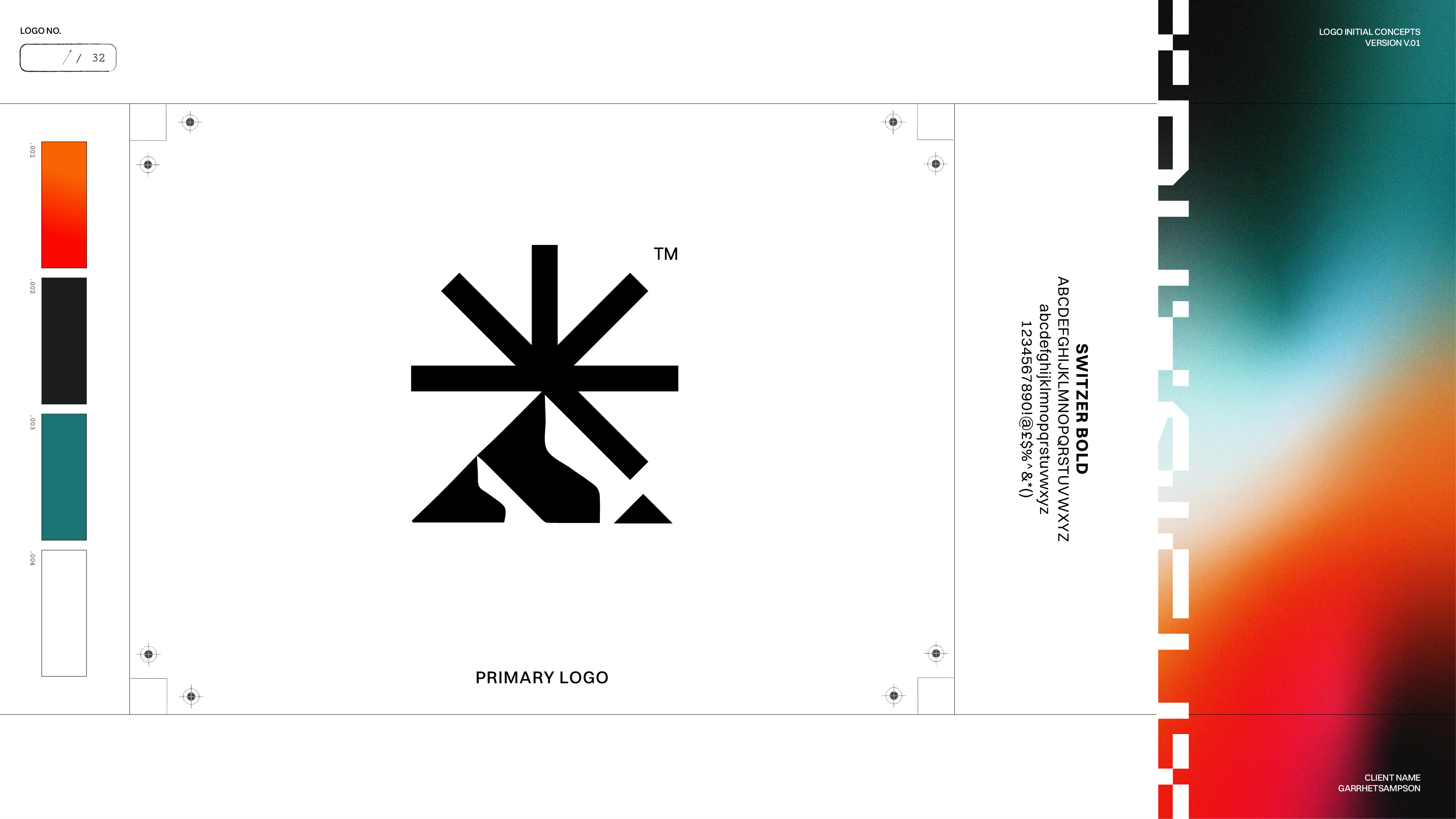
A Mark Built
on Perspective
The Truesight identity begins with a simple belief: seeing clearly changes what we choose to build. Our icon brings together two distinctive elements—a mountain and a radiating asterisk. The mountain reflects our Montana roots, providing a sense of perspective, permanence, and connection to the world around us. The asterisk represents discovery, possibility, and the opportunities that emerge when we look beyond what is immediately visible. Together, they give visual form to our philosophy of revelation over invention.
We use it selectively, allowing its expressive character to create contrast and give important brand moments a stronger visual presence.
Logo Applications
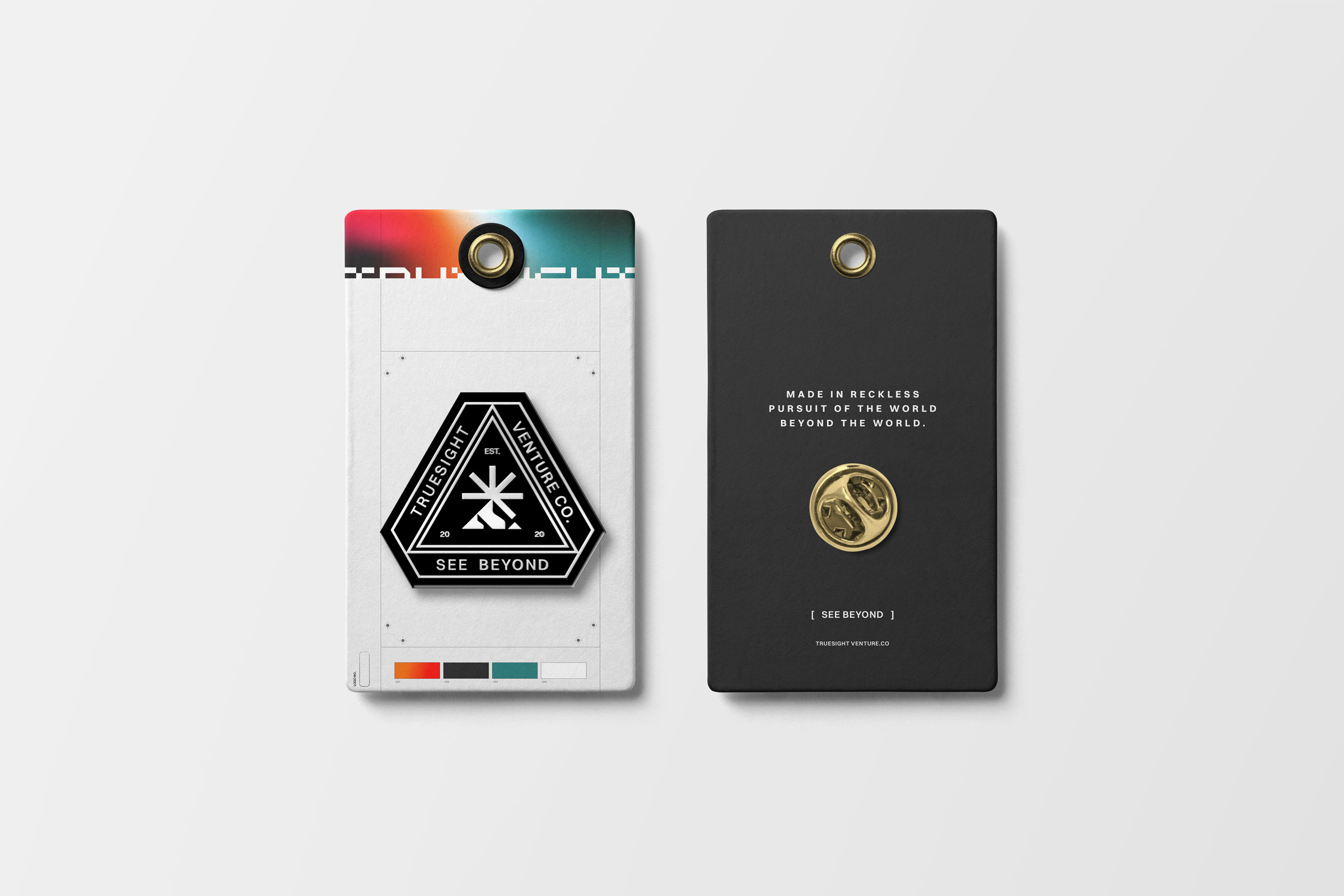
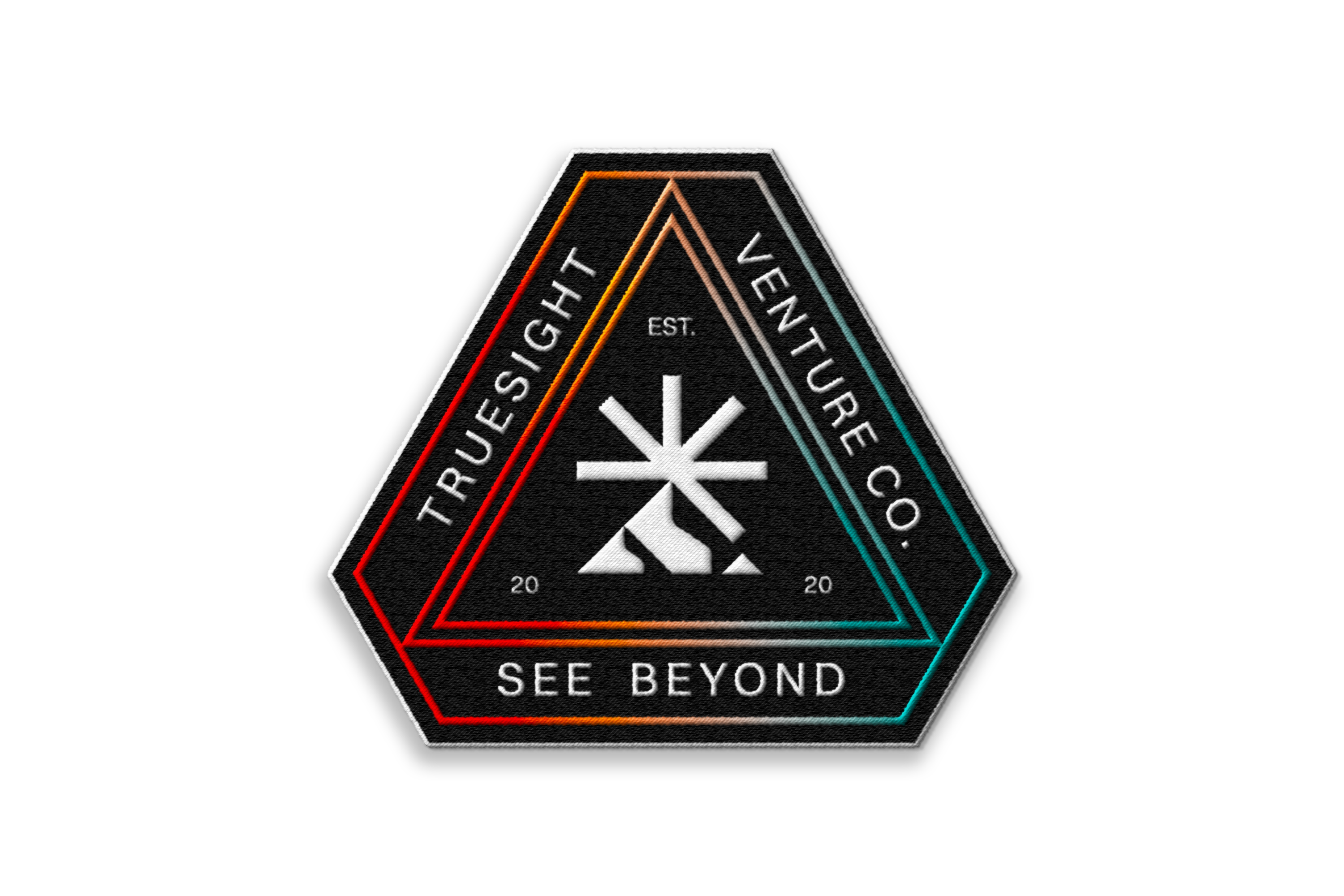
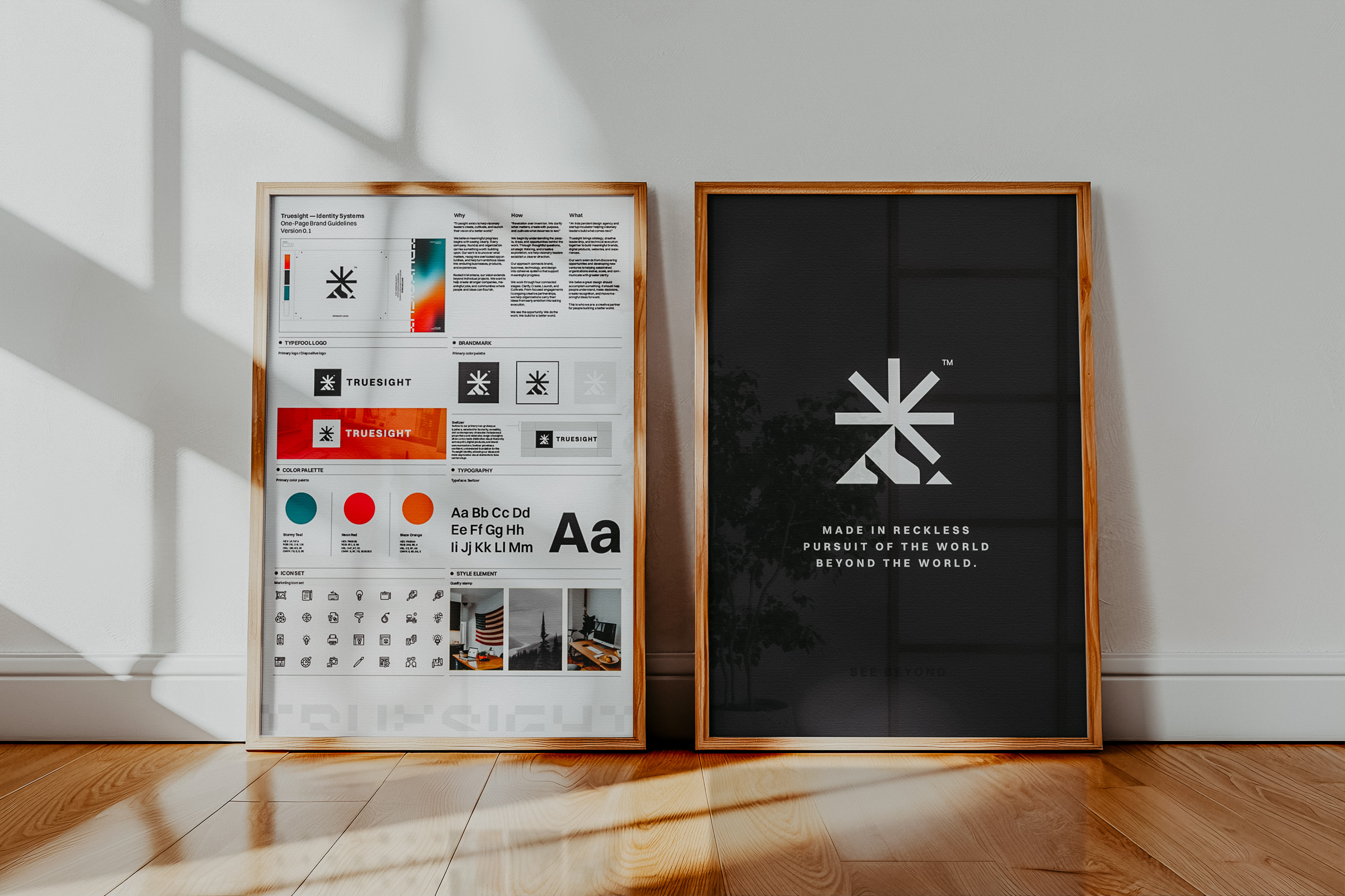
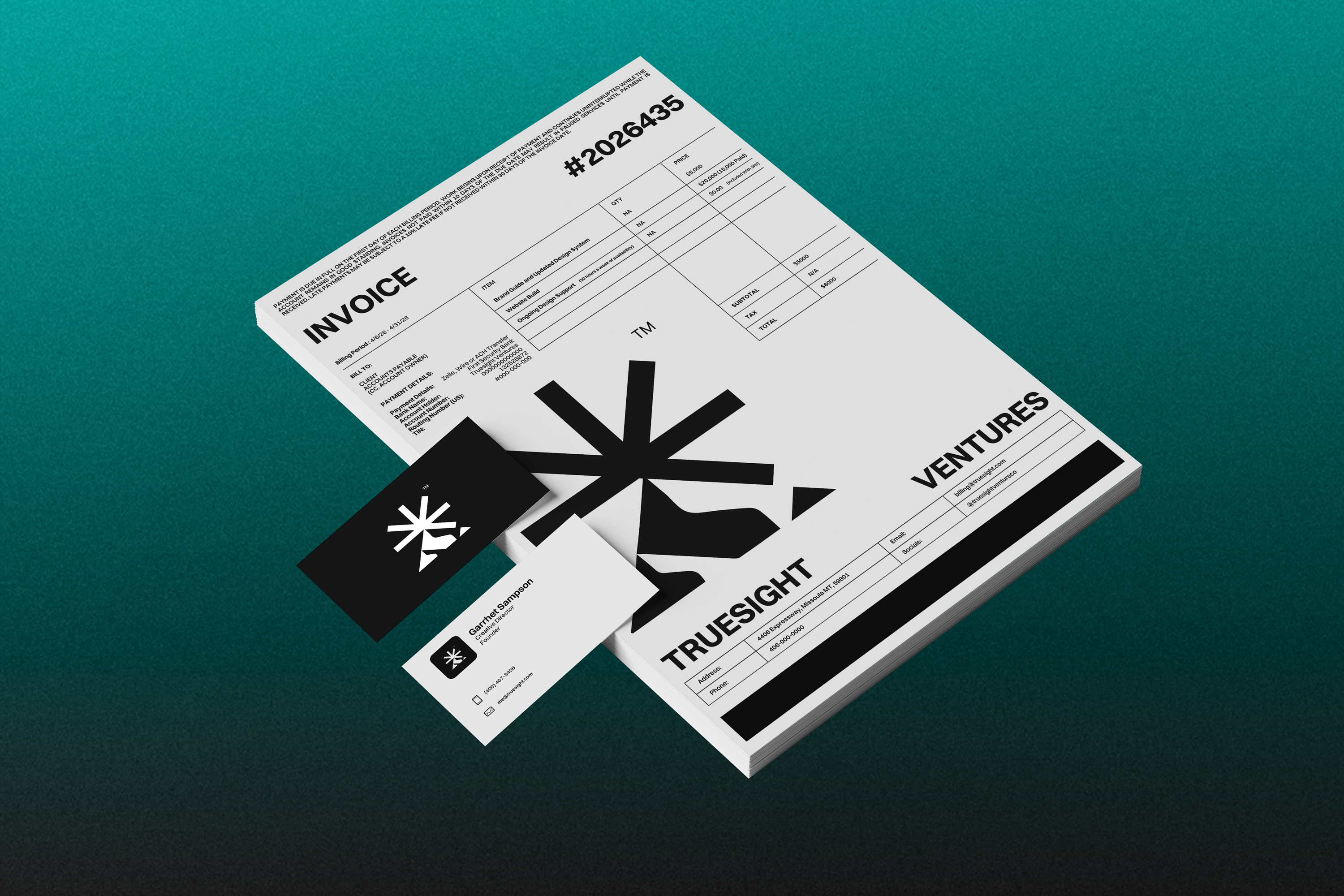
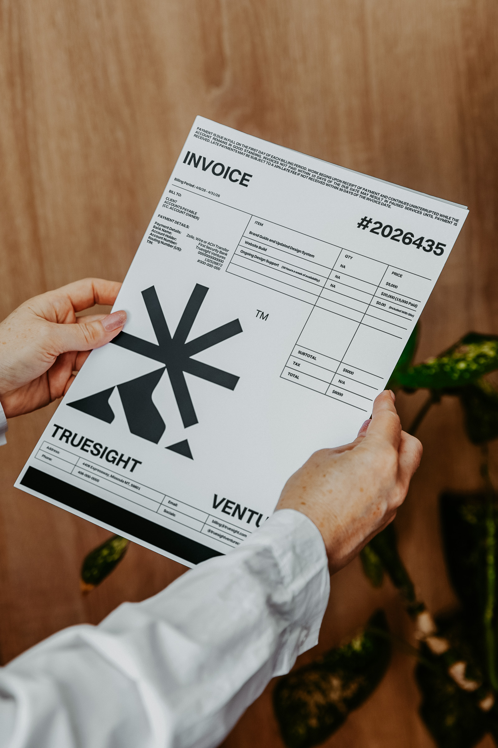
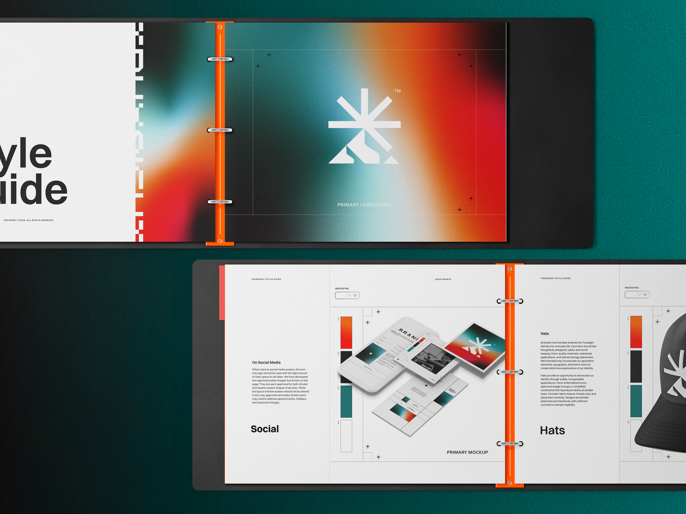
A strong identity should remain recognizable across every medium. Our logo system provides the flexibility to adapt without compromising the integrity of the mark.
A strong identity stays recognizable even when no two applications look exactly alike.
Typography
Two complementary typefaces give Truesight a balance of clarity and expression. Switzer provides the functional foundation, while Shori introduces distinctive character when the moment calls for it.







Two Typefaces
One Clear Voice
Typography helps establish how our ideas are understood before anyone has finished reading them. The shape, scale, weight, and arrangement of a message all contribute to the character of the brand.
Switzer is our primary typeface. Its neo-grotesque forms, balanced proportions, and broad range of weights provide exceptional flexibility across websites, digital products, presentations, and printed materials. It allows us to communicate clearly while maintaining a contemporary, recognizable visual style.
Shori brings a different energy. Inspired by mechanical construction and geometric precision, its distinctive forms introduce a more experimental dimension to our identity.
We use it selectively, allowing its expressive character to create contrast and give important brand moments a stronger visual presence.
Together, they create a typographic system that balances utility with imagination. Thoughtful hierarchy ensures important information remains accessible, while expressive compositions provide room for discovery and creative exploration.
Every typographic decision should make the message easier to understand and more compelling to experience.
Colors
Our color system balances character with utility. Each color plays a role in creating recognition, establishing visual hierarchy, and bringing atmosphere to the Truesight identity.
Visual Style
Our visual language extends the ideas behind our identity into a flexible system of geometry, color, imagery, and motion. Each element serves a purpose within the larger composition.

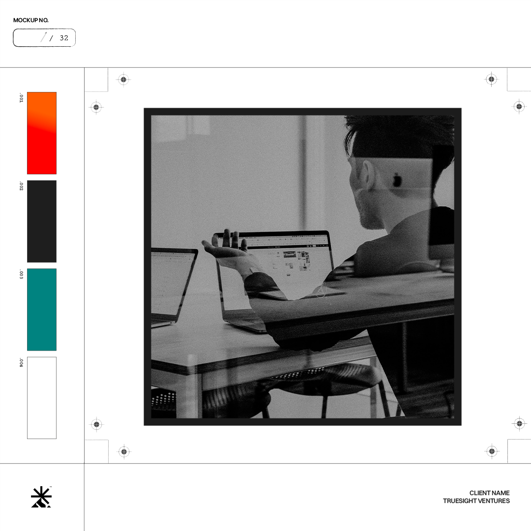
A Visual Language Built to Evolve
A recognizable identity needs more than a collection of approved assets. It needs a visual language that can adapt to new challenges while maintaining a consistent point of view.
Our system draws from the geometry of our mark, favoring sharp angles, clear proportions, and structured compositions. These elements can be expanded, repeated, layered, and combined to create distinctive visual treatments without relying on a single rigid layout.
Gradients provide depth and atmosphere, while technical labeling and restrained iconography introduce clarity and precision. Photography grounds the identity in the people, places, and environments where meaningful work happens.
Together, these elements allow Truesight to communicate across different formats, audiences, and experiences with both consistency and creative freedom. Every composition should feel considered, purposeful, and connected to the larger identity.
The strongest visual systems give people room to create without asking them to start from zero.
Guidelines
Principles That Make Better Work Possible
A good set of brand guidelines establishes a shared foundation for everyone responsible for representing an organization. It helps designers, developers, marketers, and creative partners make decisions with greater confidence and consistency.
Our standards protect the elements that make Truesight recognizable: the integrity of our mark, the character of our typography, the relationships within our color system, and the philosophy behind our visual language.
They also recognize that creative work rarely happens under identical circumstances. A responsive website, an embroidered patch, a printed proposal, and a brand campaign each introduce different constraints. The strongest approach considers those conditions while maintaining the principles behind the identity.
We believe guidelines should make the work easier to carry forward. They should reduce unnecessary decisions, encourage creative judgment, and provide a clear reference when unfamiliar challenges arise.
The objective is a coherent identity that remains recognizable wherever it appears.
Various Applications
Assets
A great brand system becomes more valuable when people can put it to work. Explore our approved materials, practical templates, and supporting documentation.
Branded Templates
Various Resources