
For a brighter future where people can encounter a church that feels alive, welcoming, and centered on Jesus.


Project Overview
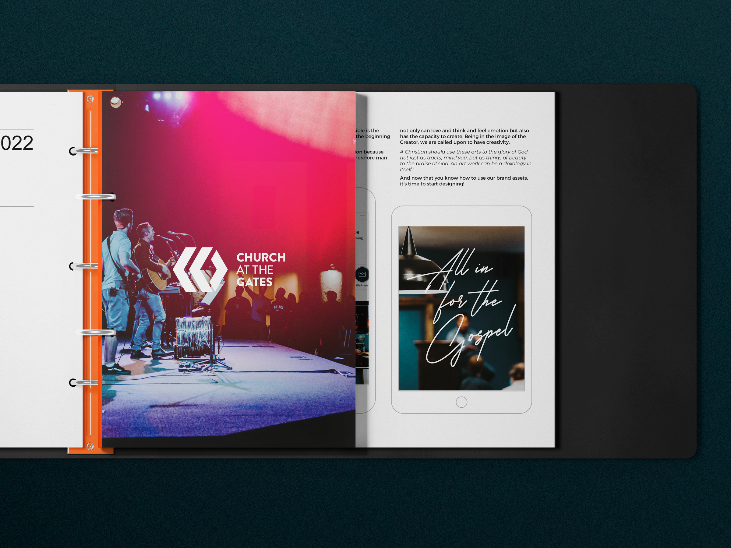
Church at the Gates needed more than a refreshed logo. The Missoula nonprofit needed a clearer visual identity that could create consistency across ministries, events, campaigns, and digital platforms while reflecting the life of the community behind it. We refined the church’s existing identity and expanded it into a complete brand and communication system spanning visual identity, typography, color, photography, web, social campaigns, merchandise, and two years of ongoing creative work.
The Gap
The existing brand leaned heavily on orange across both the physical environment and marketing materials. Without a broader visual hierarchy, individual ministries and campaigns could feel disconnected from one another or rely on the same visual cues regardless of what they needed to communicate.
There was also a cultural challenge. Church at the Gates wanted to be visible and inviting, but its community was hesitant to appear loud or overly self-promotional. The church wanted its communication to support the mission—not become the mission.
The opportunity was to create greater clarity without creating more noise: a brand that could feel energetic, recognizable, and confident while keeping Jesus, real people, and the life of the church at the center.
The System
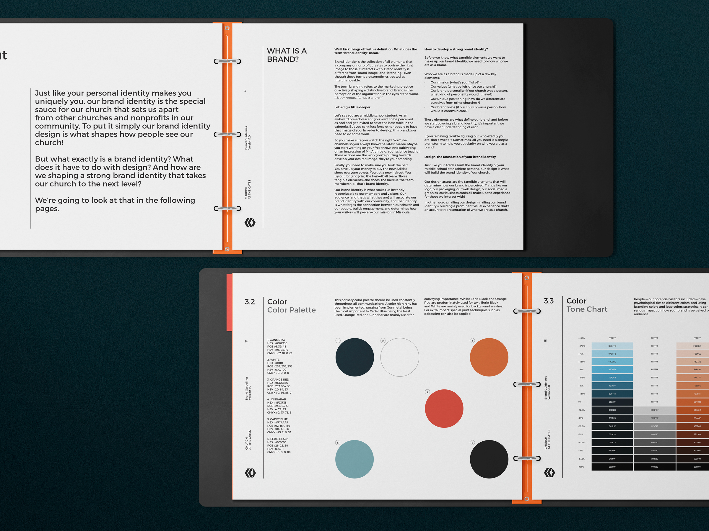
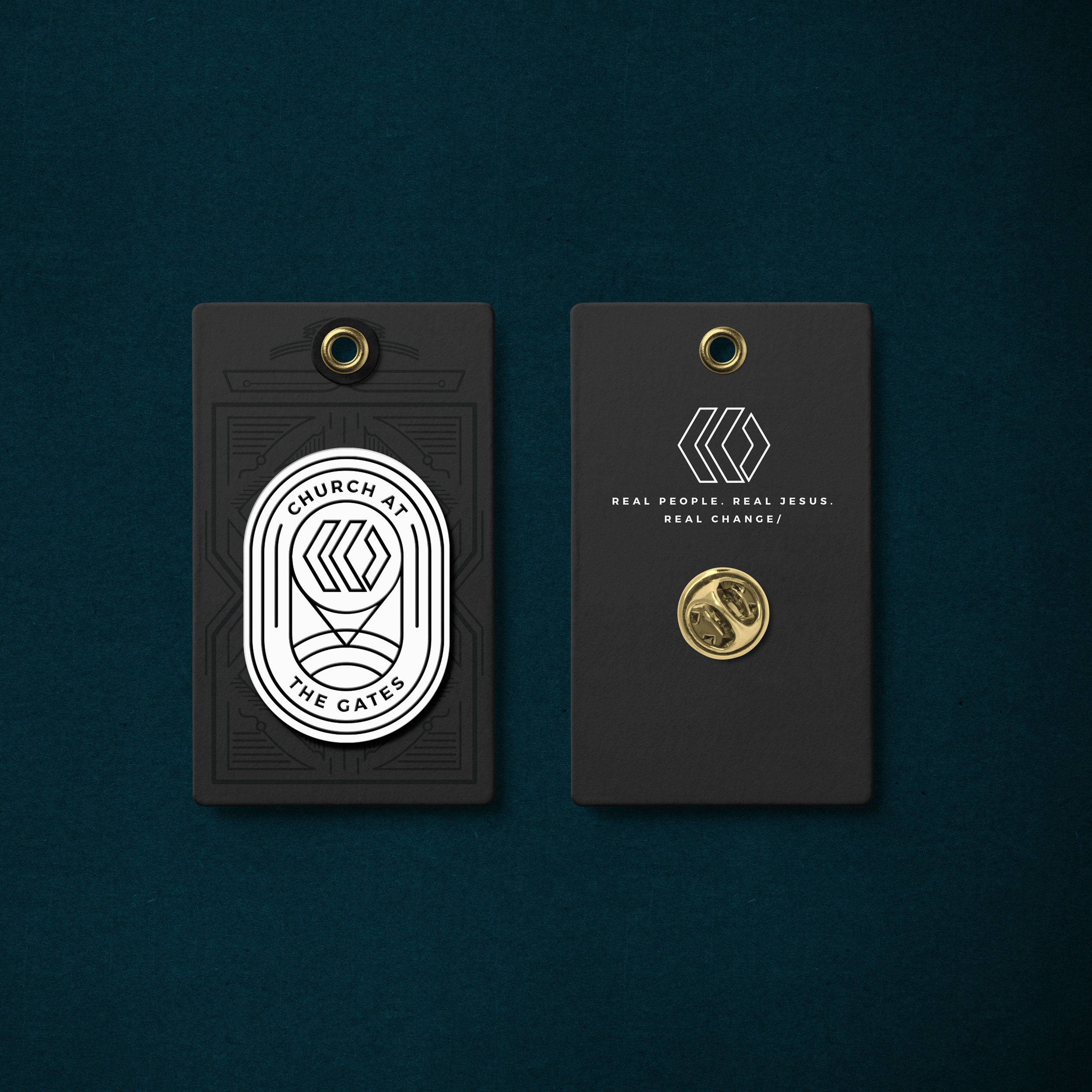
We began with the church’s existing circular mark, refining it rather than replacing something the congregation already recognized. From there, the identity expanded into secondary marks, badges, custom typography, a broader color system, photography treatments, digital standards, campaign assets, and physical applications.
A deep Gunmetal became the visual foundation of the identity, allowing orange and red to move into more intentional roles as accents for energy and emphasis. Custom CATG typography, Montserrat, and a limited handwritten accent created a flexible type system that could move between Sunday communication, digital content, events, campaigns, and merchandise.
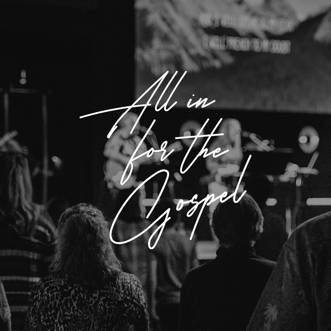
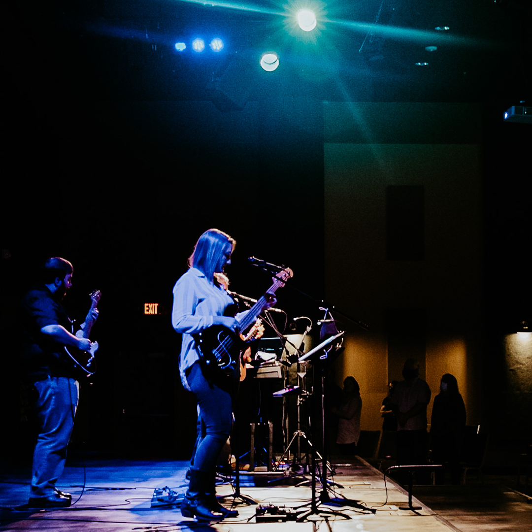
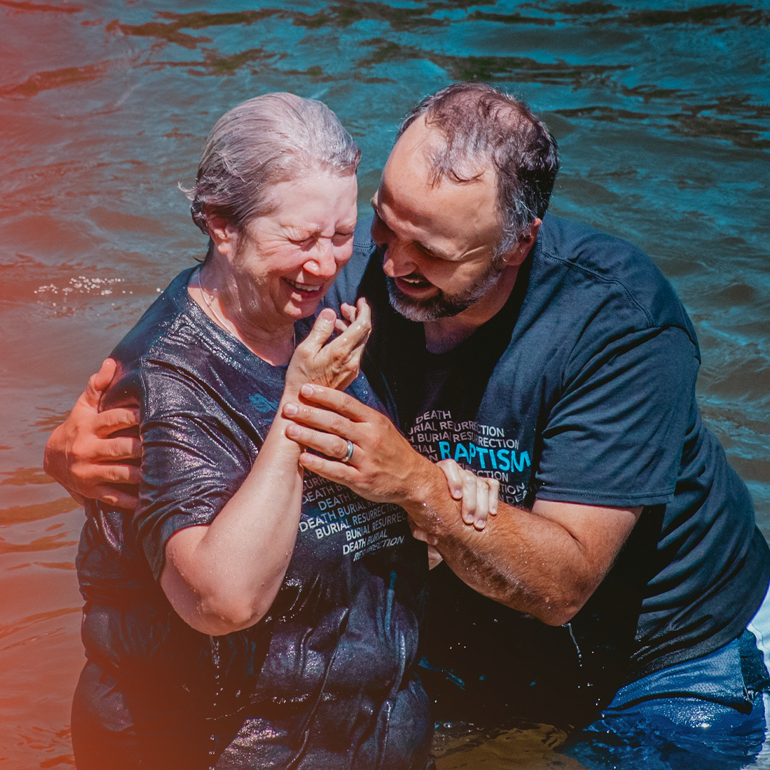
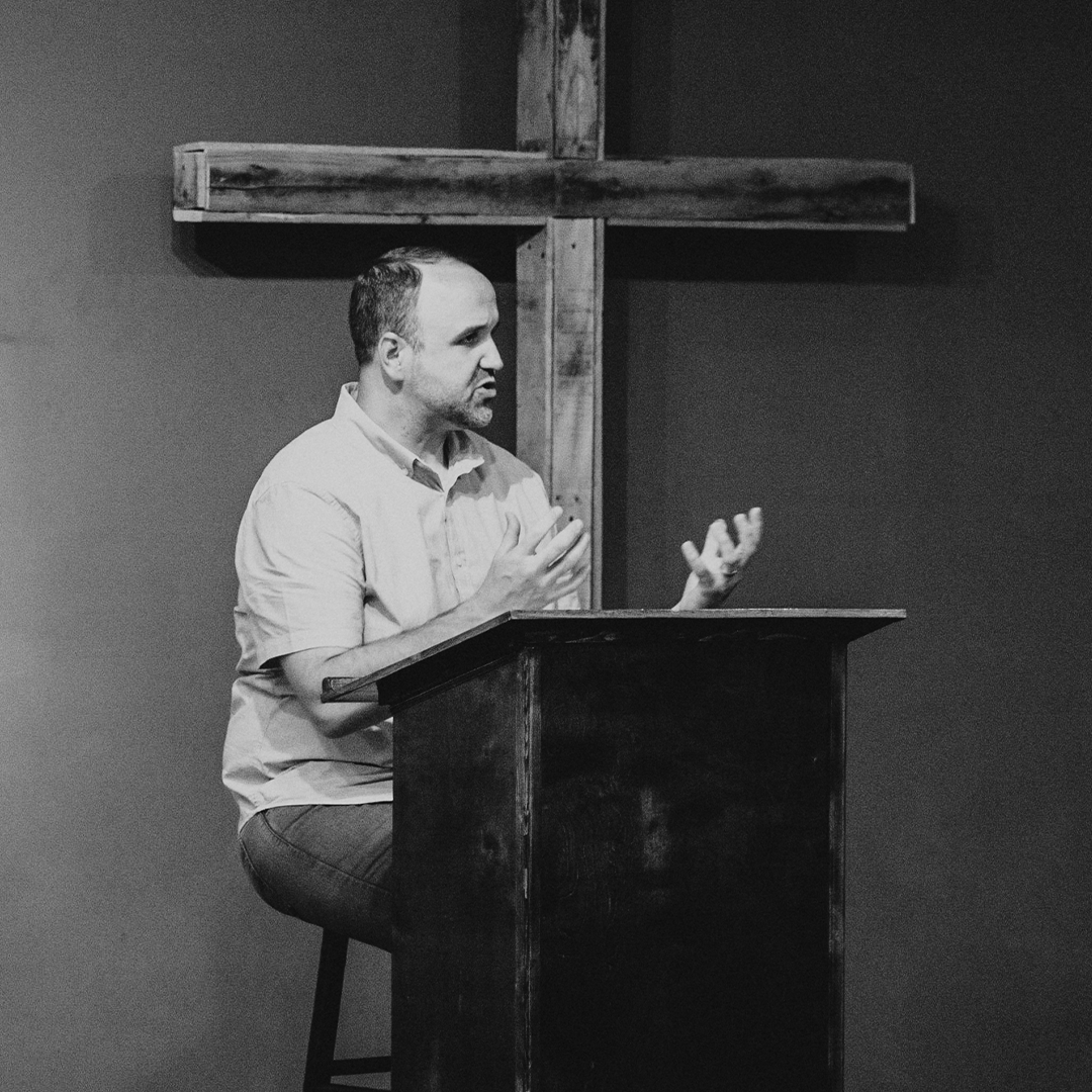
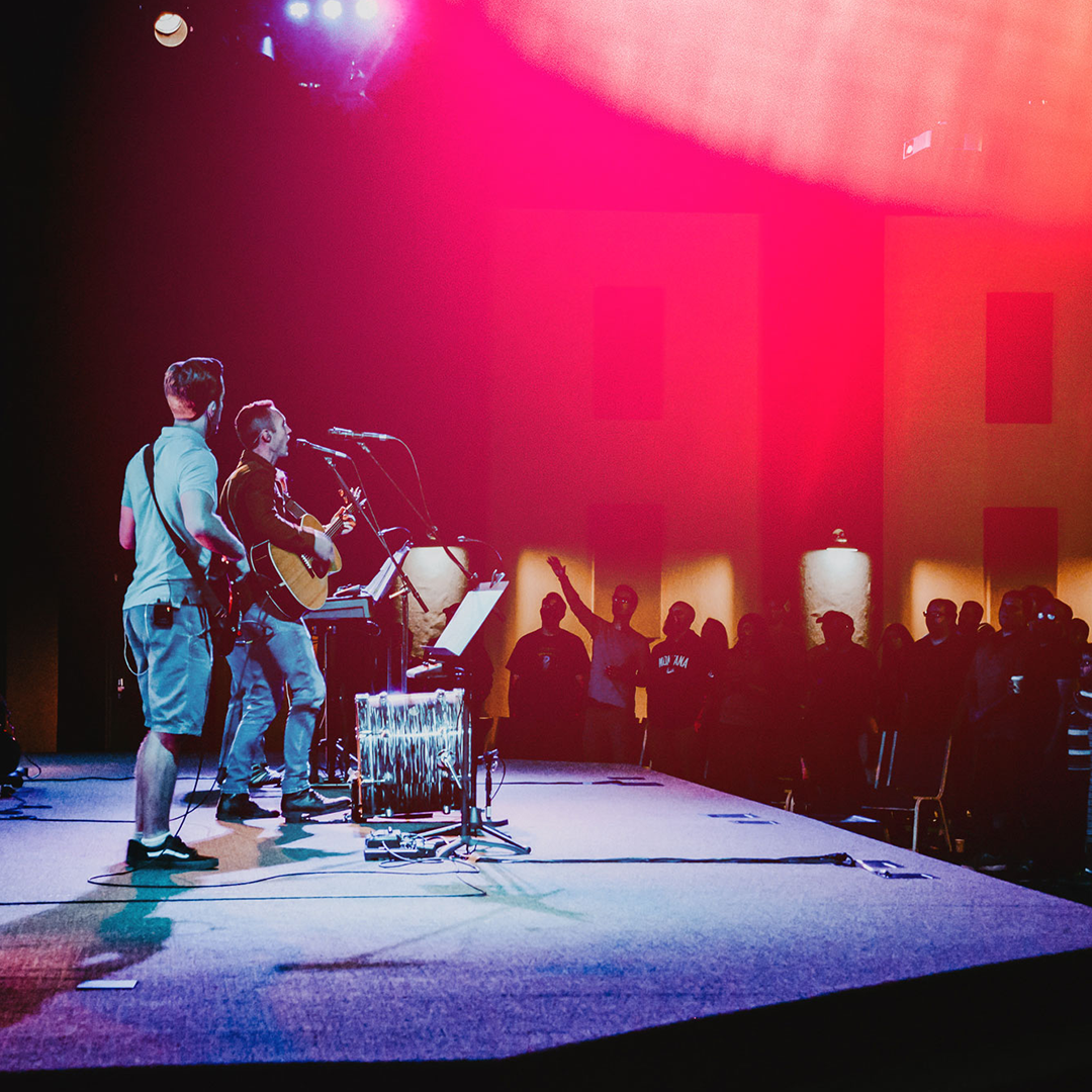
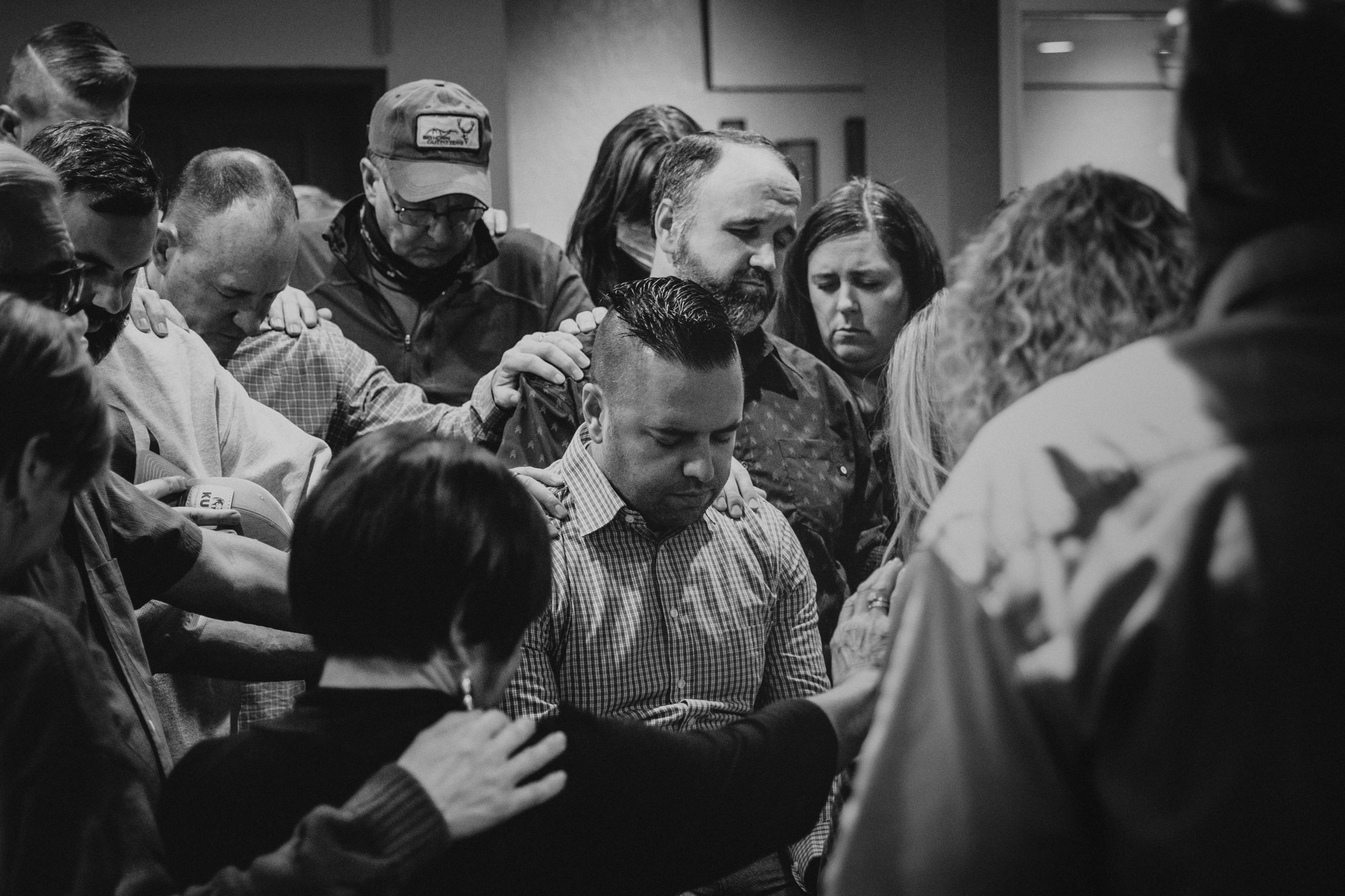
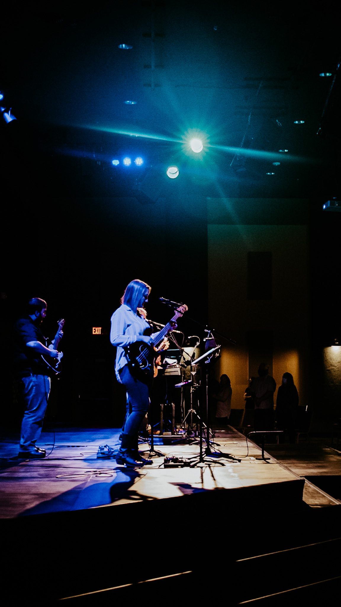
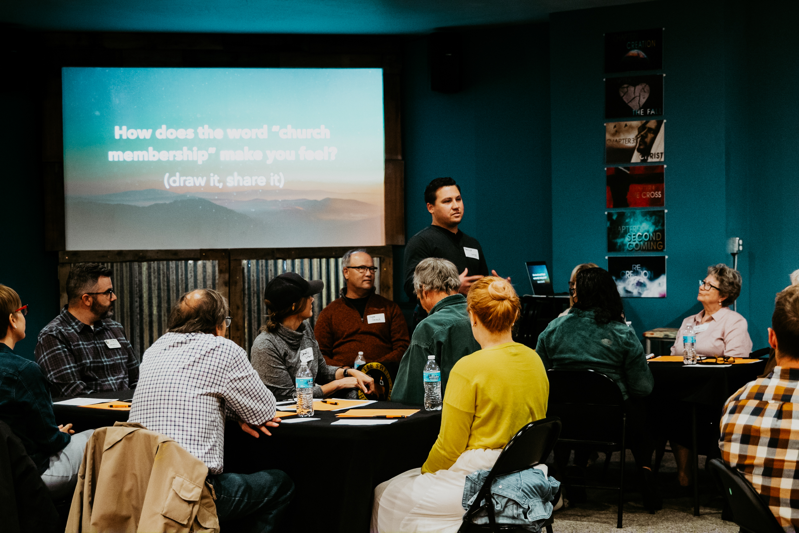
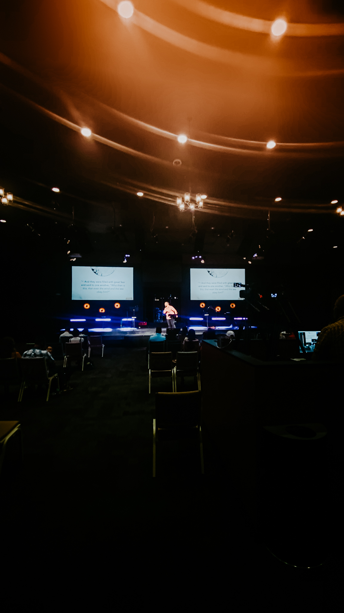
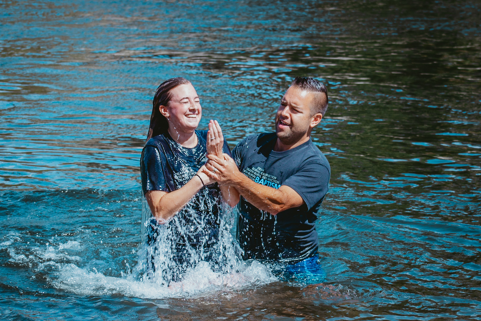
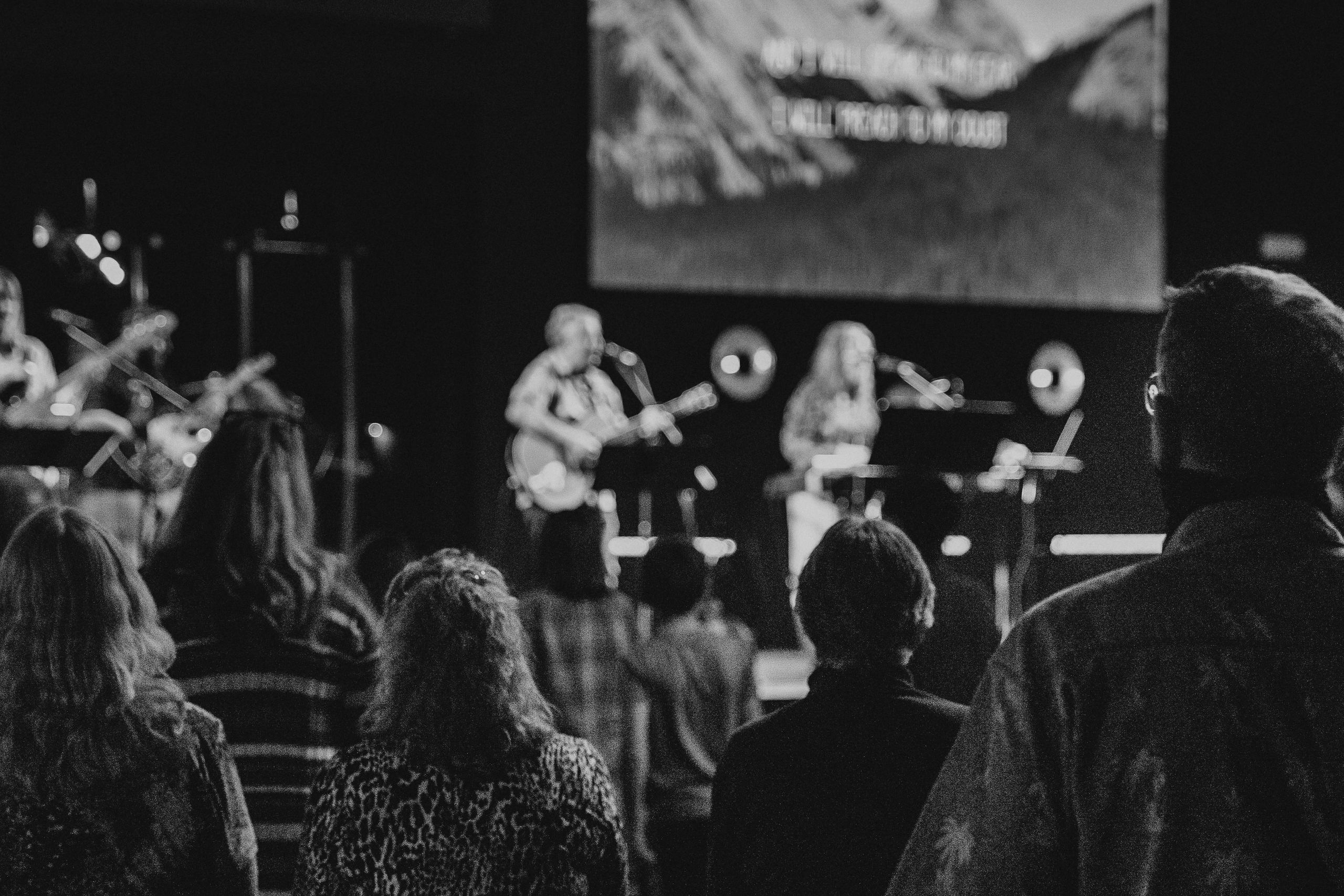
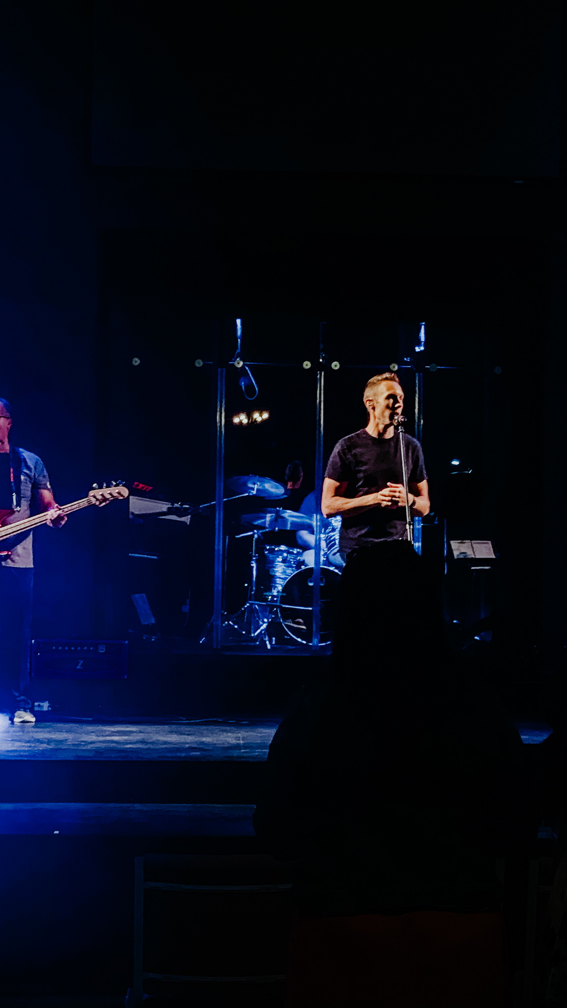
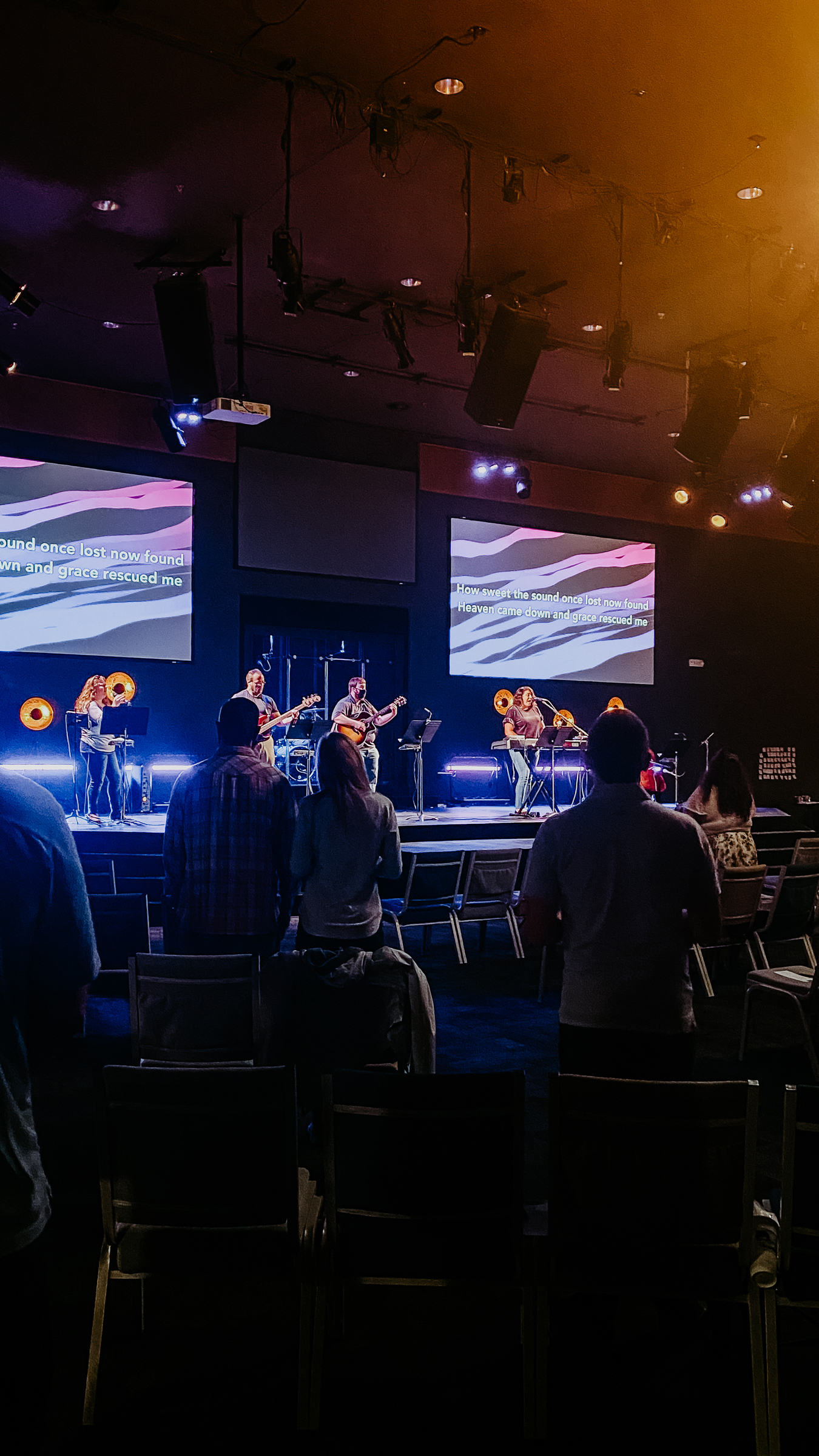
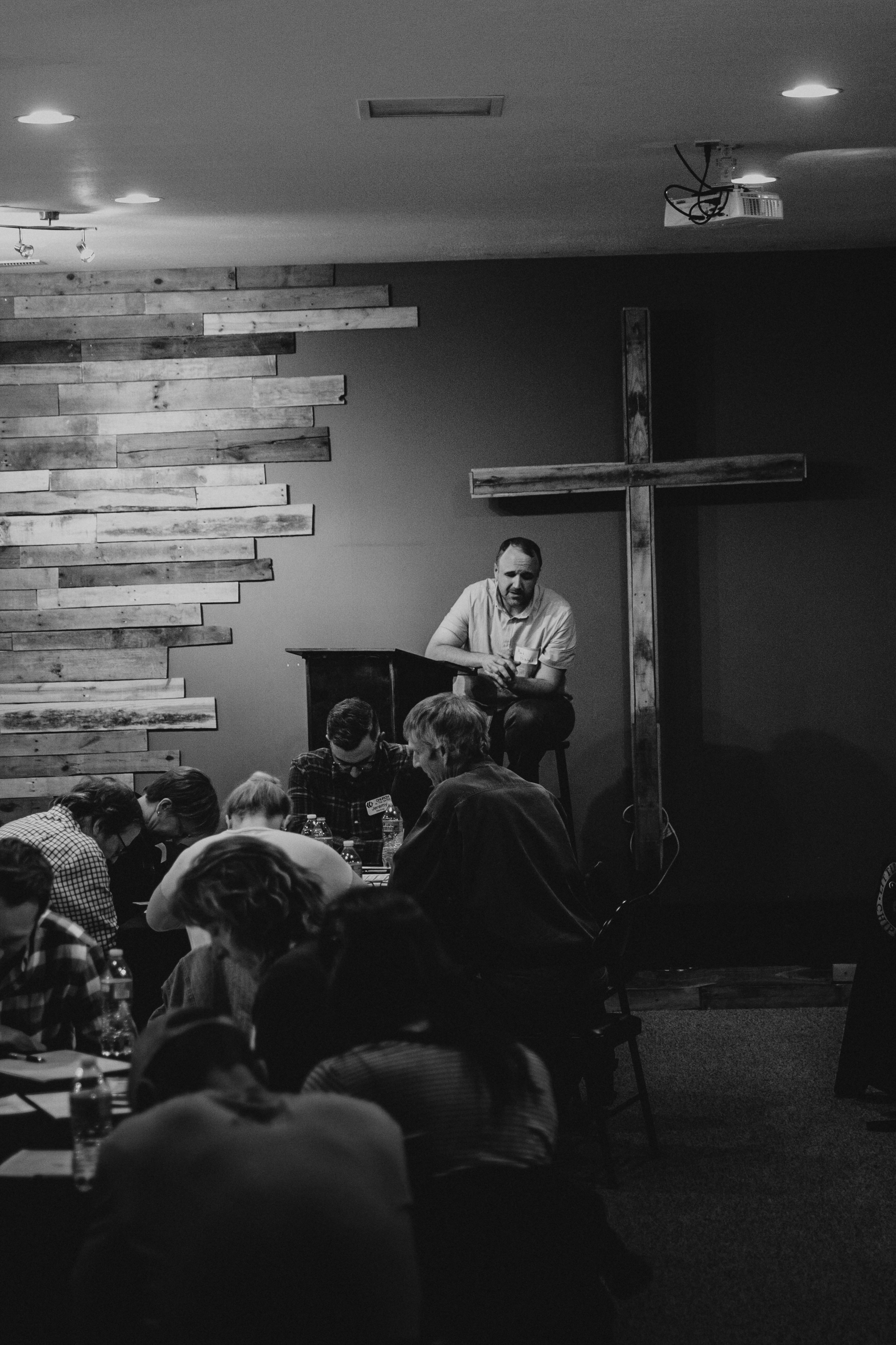
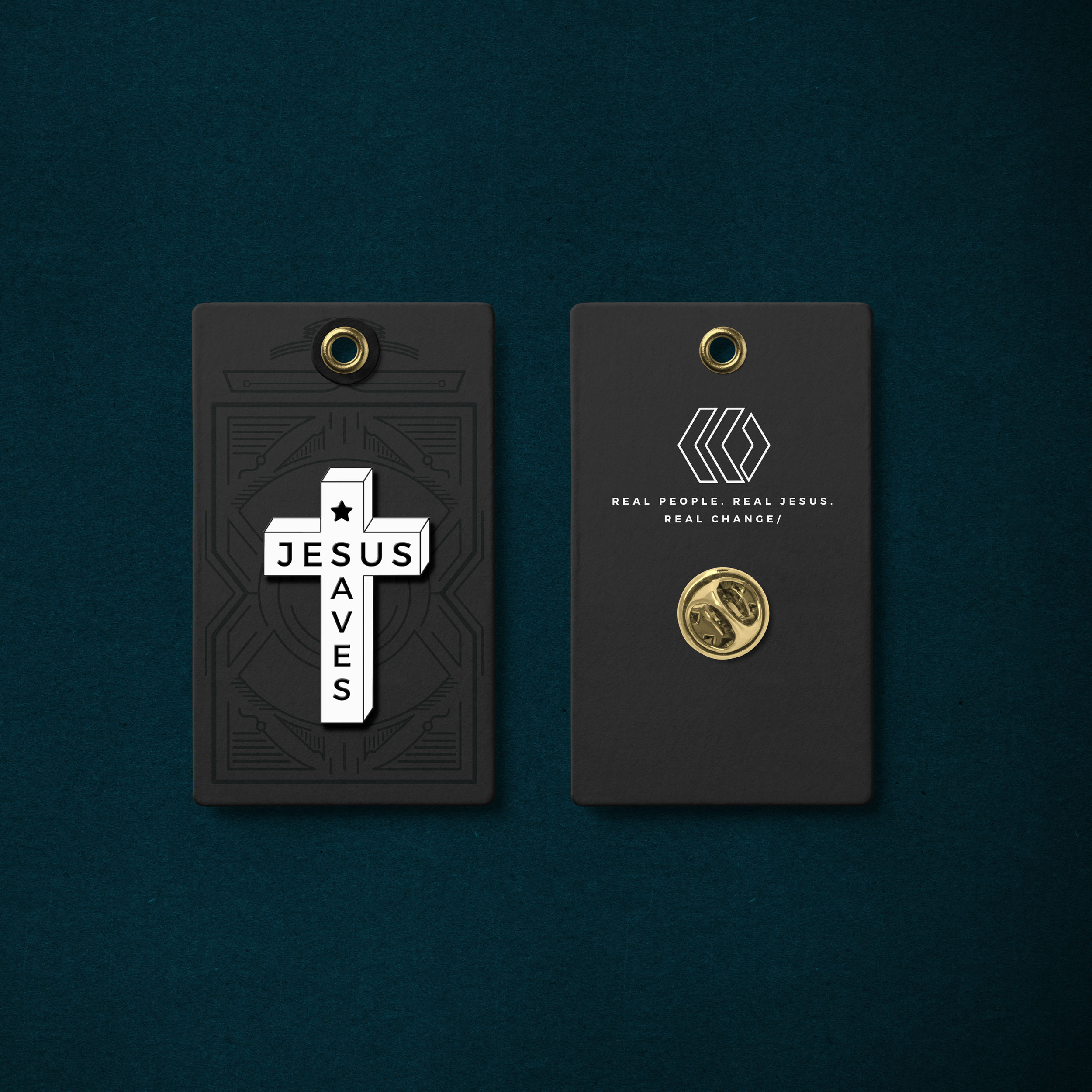
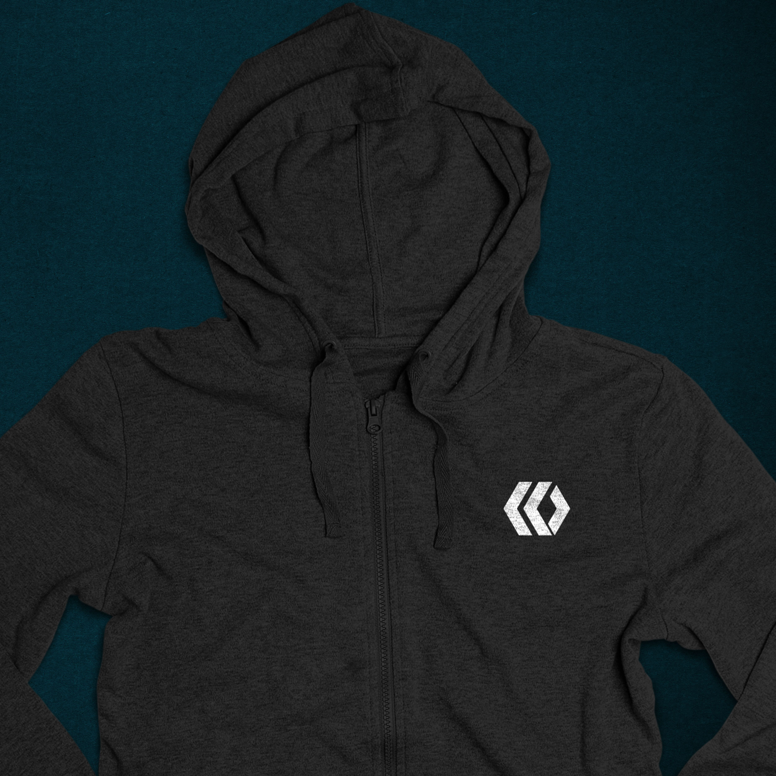
The system extended beyond graphics into the way the church presented real life. Photography centered on service, change, worship, and family, supported by consistent grading and visual treatments. Over two years, the identity was applied across social content, sermon graphics, giving initiatives, event promotion, baptisms, community service, recorded ministry, the website, and merchandise.


The Work
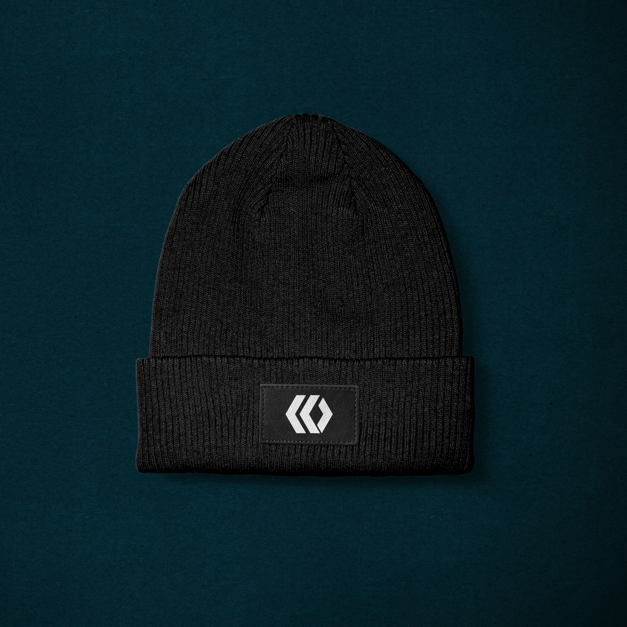
The completed system gave Church at the Gates a consistent visual foundation without requiring every ministry, campaign, or event to look the same. The work could move from a baptism photograph to a sermon series, from a social campaign to an embroidered beanie, while still feeling connected to the same organization.
That consistency also gave the church a stronger way to communicate what was actually happening within its community. Worship, teaching, service, small groups, baptisms, events, and everyday ministry could become the story rather than sitting behind a layer of disconnected announcements.
The brand ultimately became a framework for the mission rather than the focus of it—helping Church at the Gates become easier to recognize, easier to discover, and clearer about the next steps available to the people it wanted to reach.
The Results
The brand was implemented across two years of ongoing communication, including the website, launch campaign, social media, sermon content, events, giving initiatives, photography, recorded ministry, community service campaigns, and physical merchandise produced for members.
That extended implementation gave the system time to do what it was designed to do: create recognition through repetition while giving individual messages enough flexibility to remain useful.
The result was not simply a more polished church brand. It was a more connected public presence with measurable improvements across giving, engagement, and local discovery.
By The Numbers
Increase in online giving compared with prior years.
Increase in engagement across social media.
Increase in local web and search traffic.
A snapshot of the measurable impact behind the work.

.webp)
.webp)